In this era of technological and social transformation, change continues to accelerate at a rapid pace. Environmental protection has become an indispensable topic in human life, and water-based leather home improvement has brought us a non-toxic and harmless living environment.
The development department of Huai’an Kaiyue Technology Development Co., Ltd. provides guidance for everyone according to 2021 PANTONEVIEW Home Decoration + Interior Decoration Fashion Color Outlook.
In a twinkling of an eye, 2020 has already passed a quarter, and the remaining three-quarters are slowly getting better. I believe that the efforts will be rewarded. Today, we will analyze the industry trends one step at a time, grasp the color trends in 2021 in advance, and make sufficient preparations for the coming year! PANTONEVIEW Home Decor + Interior Color Trends in 2021 provides color combinations and proportions for each series of color combinations, which helps designers plan product portfolios. Color prediction images are differentiated according to the theme color series and color system.
The 9 color themes included in PANTONEVIEW Home Decor + Upholstery Popular Color Outlook all support visual images. Each trend theme includes related color stories, visual inspirations, and key color directions, providing an organized color planning process.
2021 The color and design trends of home textiles bring us into an era of technological and social transformation. As the changes continue to accelerate at a rapid pace, familiar habits are transformed into new and original ways of reading, executing, buying, and communicating before our eyes. Our eyes look to tomorrow, seeing a future full of tolerance and vast possibilities. A peaceful and nourishing color series, more emphasis is on a synergy.
These quiet connections and compatible feelings are conveyed in a “synergistic way”. This is the color story of 2021 PANTONEVIEW home decoration + interior decoration popular color outlook [PANTONEVIEW home + interiors 2021], with quiet tones and low-key background colors. Calmness and meditation, this peaceful and pleasant color series express the cooperation and coordination of colors, which is not dazzling at all, but under the contrast of light and dark, it still has a clear sense of drama.
The dark green botanical garden green is the background of taro purple and light gray-purple, and the captain blue and teal-colored harbor blue stabilize this color system. When a gem green and mist blue boost our spirits, the hazy silver purple, the seemingly gleaming silver pink, adds a faint sparkle, subtly catching our eyes, encouraging us to explore the imaginary margin
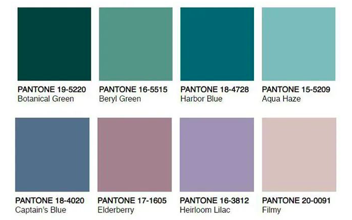
The freshness of this season’s popular color outlook may come from russet. This ruddy color once attracted our predecessors, or it may come from the sci-fi metallic tones that symbolize interstellar travel, or the rich, multicultural influence elements that are popular in fashion and the art world. A mysterious natural technique may coexist between the soft rainbow hue and the strong charm of the brilliant flowering herb. Even though bright colors and artificial synthetics shape new indoor and outdoor experiences, the traditional architecture may still lead us to organic materials and natural tones.

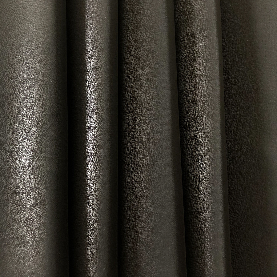 Brushed Fabric/Suede For Garments
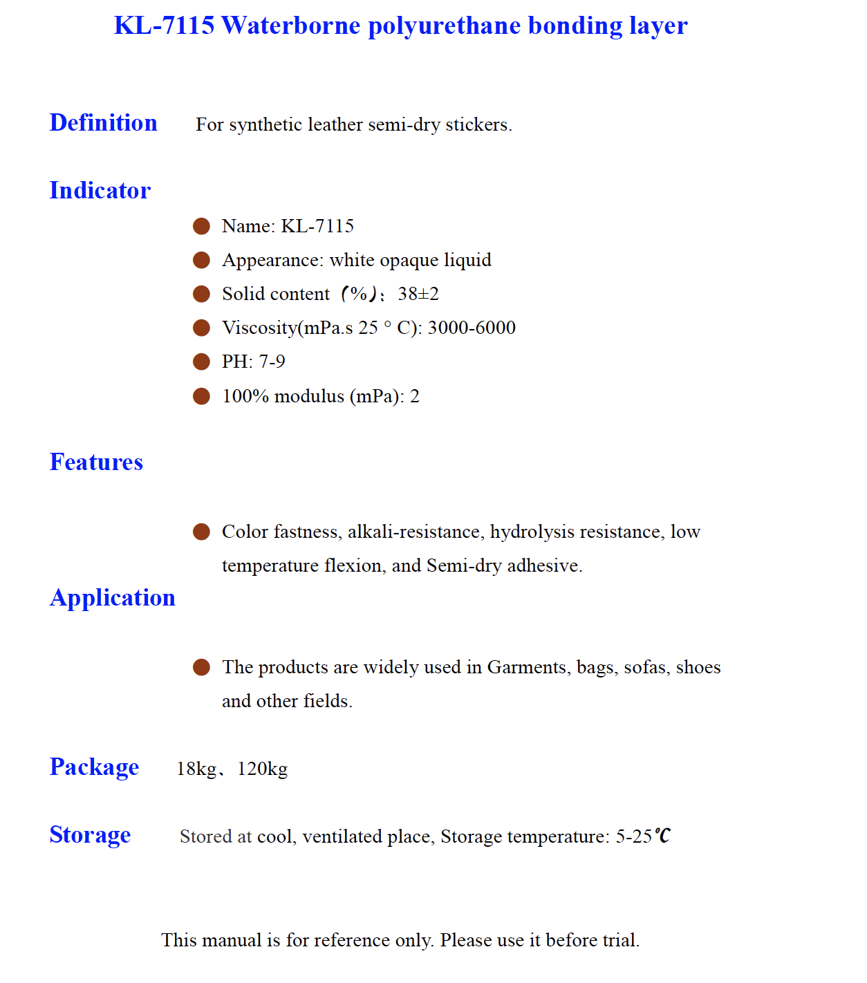 KL 7115 Waterborne polyurethane bonding layer
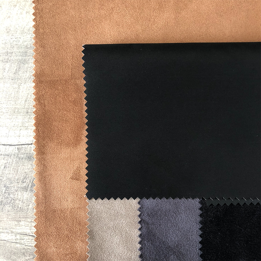 Suede-For Garments
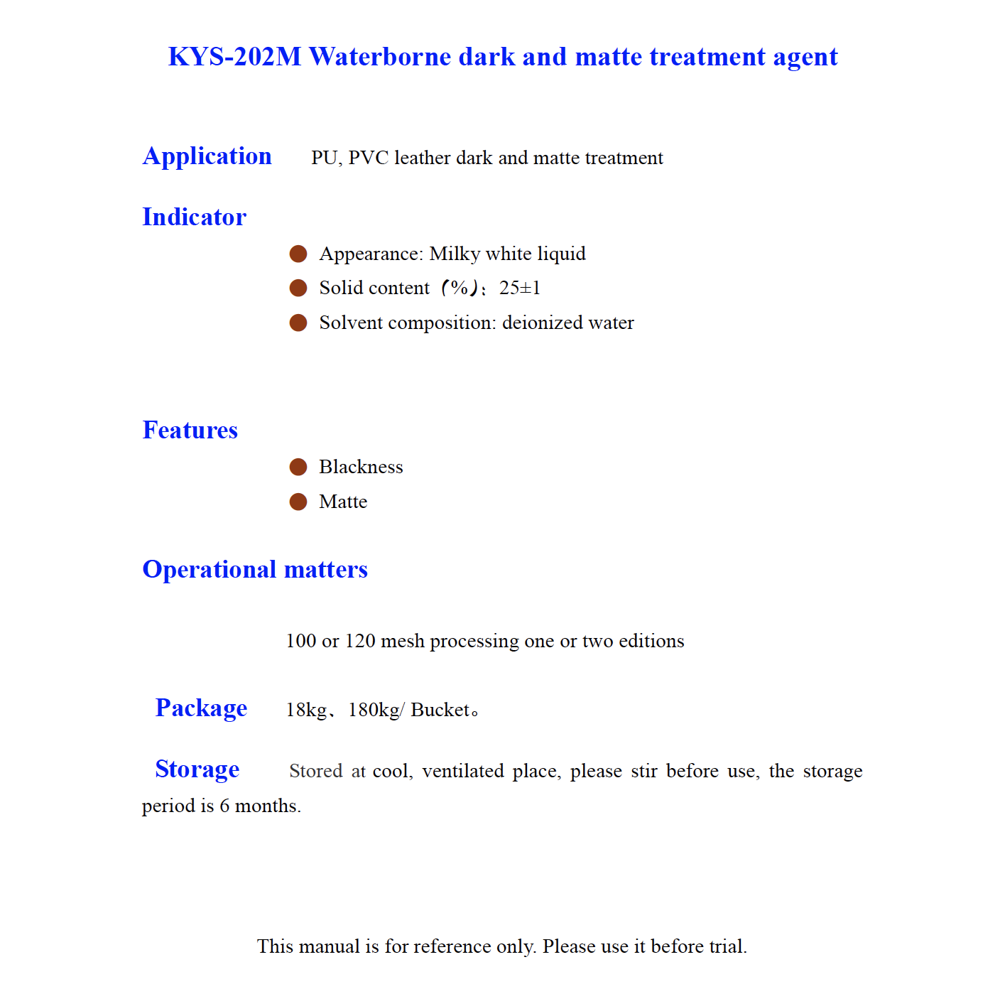 KYS 202M Waterborne dark and matte treatment agent
 Water-based Recycled Bovine Fiber Leather KY-RL0427
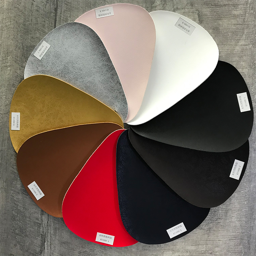 Waterborne PU for Handbag
 Waterborne leather surface treatment agent, Good haze, fine touch KYS-088M
 KYS 128M Waterborne Waxy matte treatment agent